
Seeing that mobile devices account for over 60% of global internet traffic, developers have to consider mobile-first optimisation when building. However, beyond optimizing layouts to fit a mobile phone screen size, mobile-first optimization still has a long way to go with other mobile device formats, like foldable smartphones and AI powered web interactions.
You may be wondering how a foldable mobile device changes a lot especially with AI and mobile layout design. Hold on, and read further, and you’ll understand why in a bit.
WHY FOLDABLES CHANGE THE GAME FOR MOBILE-FIRST DESIGN
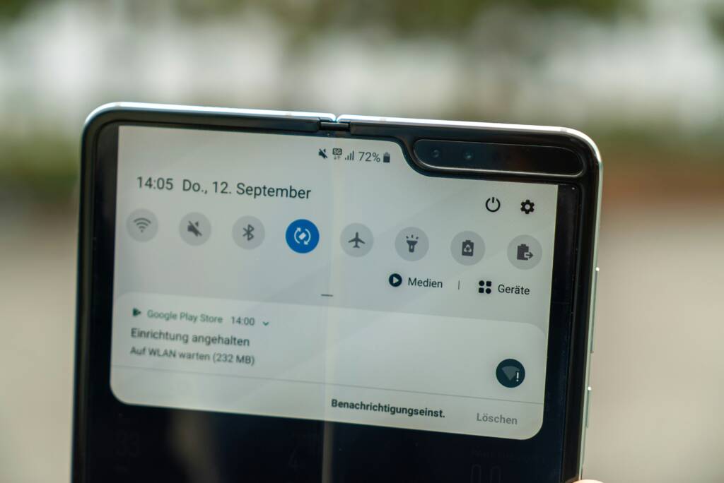
Foldable mobile phones, like the Samsung Galaxy Fold and Google Pixel Fold, have introduced a new challenge for web developers: how to ensure seamless screen adaptation. The reason is because unlike the regular smart phone screens, foldable devices can switch between the mobile phone mode and a tablet-like display (which is wider). The point to note here is that having a device with options of viewport sizes, requires web developers to enable users to smoothly adjust layouts without having to reload a page once their viewport changes.
Another consideration to be made about foldable mobile devices is touch interaction, especially for foldable phones that have split-screen modes that allow users to interact with different parts of the screen simultaneously.
HOW AI IS RESHAPING MOBILE WEB EXPERIENCES
AI analyzes a user’s device, network speed, and behavior so it can deliver the version of a webpage that is best suited for that device or network connectivity. For example, a user on a slow connection might receive a simplified layout with compressed images, while someone with a fast internet connection, using a high-end foldable might get an enhanced experience and a different layout.

THE CHALLENGE
Although the technology of foldables and AI open exciting possibilities, they also introduce unique challenges. For example, web developers must account for multiple screen configurations, hinge positions, and varying input methods. There are also privacy and data usage concerns since relying on machine learning for user experience personalization requires collecting data, which must be handled responsibly and transparently.
WHAT DEVELOPERS SHOULD DO NOW
Web developers may consider experimenting with flexible layout techniques especially with foldable devices in mind. As for AI, using lightweight machine learning models can enable smarter interfaces that prevent heavy processing on servers.
IN CONCLUSION
The future of mobile-friendly websites isn’t just about shrinking things to fit small screens, instead it’s about creating sites that can adapt smoothly to whatever device you’re using. Ultimately, with AI getting smarter, websites will soon predict what you need before you even tap.
The real question isn’t whether these changes will affect web design (they already are), but how fast our web developers can keep up. If we focus on making designs flexible and using smart tools, we can make sure mobile websites stay quick, easy to use, and ready for whatever new gadgets come our way.
Enjoyed this post? Leave a comment to let us know.